| Three Hundred |
| - Index Page |
| - About... |
| - By Year |
| Collections |
| - Comp-Grid |
| - Procedural |
| - Tactics |
| - Tiny Crawl |
| - Misc |
| Previous | Mechanic #251 | Next |
While implementing the original ASCII 3D entry, I first attempted to just test my drawing routines without the fancy math needed to calculate the depth, I did a simple offset for each layer to, I think, superior results.
![[iso.png]](set13/img/entry251-iso.png)
![[jrpg.png]](set13/img/entry251-jrpg.png)
Turns out that you can create depth just as easily without the math, using what is essentially orthographic projection. This made it trivial to make the ASCII appear to be three-quarters overhead, like a JRPG, or slanted like Ultima 7.
My dirty shame is that I don't know anything about programming 3D graphics. I have, like, zero 3D math skills, and at this point, I'm too old to bother learning how to do it. That made me somewhat afraid to attempt to implement the whole ASCII 3D thing. After all, who wants to learn linear algebra just to do a stupid ASCII prototype? So, rather than actually bother to do something the right way, I figured out how to do it the right now way, and I'm passing the results of my laziness on to you. The way I see it, if you knew how to properly manage a 3D projection in the first place, why would you be working in ASCII? There's got to be some roguelike developers out there just as ignorant as I am that want some sweet, sweet ASCII 3D.
![[depth1.png]](set13/img/entry251-depth1.png)
You start with your basic map. It has an origin at the top left, and each tile is uniformly sized.
![[depth2.png]](set13/img/entry251-depth2.png)
Next, you scale the map by some percentage. You can center the two maps around the same point. These two maps represent the bottom and the top of each pillar.
![[depth3.png]](set13/img/entry251-depth3.png)
If you calculate the difference between the regular tile's position and the scaled tile's position, you will have two points that create a line. As you move up in height on the pillar, it will be along that line. Thus, if you want something that is 50% up the line, you divide the line by half (or dx/2, dy/2 plus the origin). Boom, done. That 50% can also be used to know the scale of the ASCII characters too, if you want them to change size as they go up (though it largely looks fine without it) I'm sure that the actual math needed to calculate depth is something simple, like 1/z or something - but I'm stubborn, and gosh golly, I ain't ever changing.
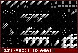
If you go back to 251.1 (reprinted here, without permission), you may notice the trees, windows, grass, and bridges - even the door in the bottom right corner. Rather than simple repeat a character, each character is translated into a block of characters, ranging from 0 to 4 characters. Basically, each layer you draw using the next character in the array, until you run out of characters. This allows me to have things like bridges which are only one or two layers tall, or grass which is only knee high. My thinking is that it would allow me to design monsters and units using characters, but in practice, it didn't work out very well for that purpose. I think partly, it was the font I used, and I think the effect could've been improved considerably with color and better lighting options (I'd increase the brightness of non-terrain to make them pop a bit more).
![[floors.png]](set13/img/entry251-floors.png)
One of the problems with ASCII is that it makes terrible terrain to walk on. For instance, the floors are little dots and the second floor is a little dot slightly higher up. Even with the parallax effect of the depth perspective, it does little to indicate a second, higher walkway. Really, what is needed is two things. The first is some sort of blocking for the ASCII characters below. A floor dot has a lot of empty space for the previous floor to show through. The simple solution to this is draw a black rectangle under the dot. So a layer underneath the current one. In this example, I actually draw obscuring black rectangles under everything in the second level that isn't empty space. This creates a small black border that differentiates between the levels. I like that because of the second thing, which is clear delineation. Basically, if a walkable floor could be any random height, it would be impossible to tell what was going on without the screen constantly in motion. Turns out, dots are terrible at conveying depth. However, by obviously breaking the game world into two, distinct levels, communication of the height of things, and the relevance to the player becomes more easily understood. But this is just a personal preference.
It just so happens, there is a Three Hundred Prototypes entry for this (and the previous ASCII 3D) idea. Go play with it and see all these things in action. My wife says it is ugly.
|