|
Mechanic #022 - Tiny Crawl |

Category: Banner | Posted: 05/30/07
A full featured RPG designed as a mini-banner. |
![[tiny1.png]](set02/img/entry022-tiny1.png)
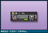
Some long time readers of Squidi.net, back when it was a webcomic, may recognize the above image. It was originally used as a mini-banner (88x31 pixels) to advertise the site to others. It's a good banner, I guess, but I thought it would make an even better game.
Today's entry is not so much a brilliant new idea as it is just me hosting a bunch of mockups I did a few years ago about what that game would look and play like. My criteria was that it had to be both a game and a banner. That is, it's primary purpose was to advertise the website and to be compact and quick loading such that others could put it on their webpage with minimal effort. It was supposed to be a game second - something that you could play that would provide a deep and interesting experience. Small in size only.
At the time, I imaged a bunch of banner-sized games all on one page. I thought it would make a brilliant new internet meme for programmers and graphics artist. To create something small, but visible. A sort of reductionist game design. When you only have 88x31 pixels, what kind of game would you be able to make? What kind of game designer would you have to be? I think it would've made extremely nifty contests. Certainly cooler than those 4 color competitions. 4 colors? That's not a limitation!
I may revisit this banner game idea with different genres and concepts later in the 300.
![[tiny2.png]](set02/img/entry022-tiny2.png)
This is the attract screen. Basically, it features the little Maxim guy walking with a nice parralax little scrolling background to it and a little "push spacebar to begin" flashing on it. After a while, it'll show little animations of gameplay meant to show people what the game is like - just like the attract mode on every other game ever made.
![[tiny3.png]](set02/img/entry022-tiny3.png)
The world is essentially like the one featured in Valkyrie Profile. You can continue left or right, or perhaps up and down by using ladders. You can also move away and towards the screen, moving to other planes. Basically, a three dimensional maze.
![[tiny4.png]](set02/img/entry022-tiny4.png)
You can find treasure chest laying around. You can decide to not open it and walk in front, so it doesn't actually hinder movement any.
![[tiny9.png]](set02/img/entry022-tiny9.png)
The world by no means needs to be a linear strip. Though the camera is limited to a minute screen, it could scroll up and down for things like ramps. If this were an action game, such limited visibility would make vertical camera movement a dangerous thing, but since there are random encounters, it's not as much of a problem.
I think that this game could be played with the mouse. The status screens and stuff use icons only a few pixels wide, so it would require a steady hand, but it's possible. For movement, just move left or right depending on where the mouse is clicked on the screen, and enter doors or activate objects by clicking on them when the character is right next to them
![[tiny5.png]](set02/img/entry022-tiny5.png)
The inventory screen presents little problem, so long as you can draw what an object looks like in 8x8 pixels. I figured that you wouldn't be able to do much variation between different swords, so offering a large image to the left would solve that problem.
![[tiny6.png]](set02/img/entry022-tiny6.png)
I have a home made 5x5 font that I like to use for my pixel art. Though you can do it smaller, it does have the advantage of being fixed width and being able to represent every uppercase character in the alphabet perfectly (if you have 4 or less pixels, E's look funny, for example). This is a very small font, but readable even at 1x1 resolution (these screens are shown at 300% size). Even still, there's not a lot of room for text in such a tiny screen. Even if one got rid of the large item icon, you'd only get another three or four characters. So, expect lots of abbreviations and not a lot of story. Dungeon crawls don't need story anyway.
![[tiny7.png]](set02/img/entry022-tiny7.png)
With screen real estate at an absolute minimum, the kinds of information you can represent is equally minimal. Though I've kept the stats and stuff simple in my example, there is still the possibility of unique gameplay here.
![[tiny8.png]](set02/img/entry022-tiny8.png)
Combat is simply turn based. You can, at most, fit three characters on the screen at one time. Perhaps you could use scrolling or swap out characters for parties or something. Still, the first Dragon Quest game had one hero and one enemy per battle and it did fine, so I think 1 vs 2 still opens up plenty of opportunities.
I am not particularly happy with the mini-menu system at the top. Getting icons to look like something at 5x5 pixels is not easy. Still, I thought it was a superior solution than using text that you had to scroll through.
And there you go. An RPG is less than 3,000 pixels.
|