|
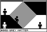
Mechanic #002 - Grey Matter |

Category: Neg-space | Posted: 05/10/07
In Negative Space, things aren't always black and white. Sometimes, it's black and white. |
Negative Space works on a very simple, but unusual principle. That which is black
is not white, and vice versa. But the thought immediately jumps to mind what happens in
the, literally, gray area in between. What if something were both white and black simultaneously?
![[dithered.png]](set01/img/entry002-dithered.png)
This can be achieved in two ways. One is to use dithering, just like old BW Macintoshes used to use in their backgrounds. A checkerboard where every other pixel is black, alternative with every other pixel being white. To the human eye, it is very effective at creating a shade of gray. Plus, it has the added benefit of not breaking two color theme. The other alternative is to simply use 50% gray as a unique color. Even so, it should be used somewhat sparringly to prevent gray from becoming an equal to black or white. It should always be subordinate terrain.
Two possibilities appear. The first is that gray, which is both white and black, represents equal negative space to both. That is, both the white and black silhouette can travel through gray areas as if it were empty areas. This would create a sort of vacuum, where both white and black can exist simultaneously – perhaps even interact directly.
![[neg-gray.png]](set01/img/entry002-neg-gray.png)
In this example, you can see a very simple way to swap black and white's vertical positions. It would be difficult to do with without some special gameplay mechanic (like destructive or morphing terrain), but here it is a very economical solution. In addition, trying to reconcile how the negative gray space interacts with the black and white worlds adds an additional component of mental gymnastics that makes even something this something into a puzzle - or at least, the illusion of one. Using negative gray space creatively could create some very unique and interesting puzzles.
![[gray-example.png]](set01/img/entry002-gray-example.png)
Here is an example of how negative gray space allows white and black to move around between their own areas. There's really only one "trick" here (the black stripe in the initial fall not affecting white like it seems it should), but this was a quick example. I've already figured out a few mind boggling puzzles that could be pretty cool, like a checkerboard of alternating black, white, and gray. Frankly, from this example, I have an easier time following Black's path through the level than White's. That's the nature of negative space, I guess.
The other possibility is that the gray area represents matter which is solid in both universes. While this doesn't have nearly as many trippy puzzle aspects to it, it can be useful in defining the boundaries of the play area. This is particularly important in a game which involves the back and forth deformation of the negative space. Having something which definitely cannot be moved or changed could help reign in the chaos of the constantly shifting color-scape.
![[pos-gray.png]](set01/img/entry002-pos-gray.png)
Likewise, that sort of play could result in levels playing out rather similarly. With no boundaries, there would probably not exist diverging strategies. By using gray matter to define things like choke points, mazes, defensive structures, and so on, each level can be given a more uniquely playing and looking experience.
If using dithering and destructive terrain, it could represent a difficult technical challenge. However, if one internally treated gray as a separate color and then simply drew it as dithered BW, you could have the technical ease of one with the standardized visual representation of the other.
![[dithered2.png]](set01/img/entry002-dithered2.png)
Dithered gray has a nasty side effect of affecting the silhouette of objects in front of it, white or black. In puzzle games where the silhouette is not significant, this silhouette can be retained by having a small white or black outline surrounding the character. Above shows silhouettes with no outline, a one pixel outline, and a two pixel one. It's still not perfect, but it works a lot better in motion.
Something else worth mentioning. Dithered gray, at high resolutions, can create a nasty flicker effect while scrolling (try scrolling your browser window). At a low resolution where each individual pixel is more pronounced, it won't be as bad. Though I prefer the standardized 1-bit dithered approach (I grew up on a BW Mac Plus), I realize that the technical limitations are significant.
![[colors.png]](set01/img/entry002-colors.png)
One could potentially add additional colors and contexts – for instance, one color representing solid matter and the other representing universal negative space – but I think it would get too confusing. Gray makes a decent mechanic simply by nature of fitting within the 1-bit world (dithered gray, at least). More colors would mean more special rules and the concept is trippy enough without added complexity. It's better to have only gray (if that), and apply only one meaning to it.
Solid gray matter is fundamentally destructive to the illusion of black vs white. The negative gray space contributes to the illusion, while this takes away from it. As such, solid gray matter should be avoided if at all possible. Any other solution found that works with the negative space concept directly will ultimately be a superior one.
Negative gray space would work best in a puzzle game, where the mental jumps needed to interpret how the duel empty space works would be appreciated. In other genres, I think it would be distracting. Still, I think negative gray is a good showcase for the weirdness and possibilities inherant in the Negative Space idea. If I were making a game with the intention of exploiting the idea for attention, negative gray would be the perfect cherry on top - use sparringly, of course, but extremely effective.
|